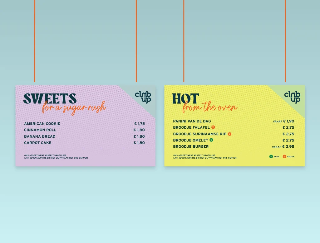
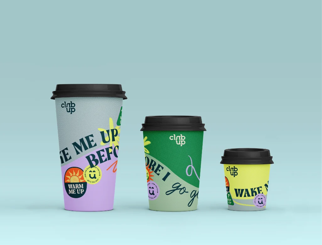
We created the positioning and brand identity for Club Up, a catering concept for Dutch school canteens, with illustrations and stickers. See the project.
A canteen that feels like a co-working space, a house party, and a coffee bar all in one? Yes, it’s possible! And that is Club Up, THE ultimate place for the best time of your life: your student years!
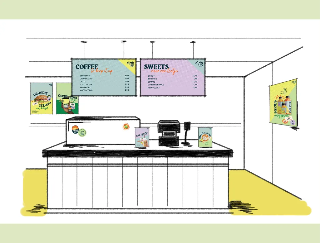
Our studio was asked to develop the positioning, strategy, concept, and design for a new catering concept for canteens at universities of applied sciences across various locations and study programs in the Netherlands.
UP stands for UPlifting, keep it UP, don’t give UP, the only way is UP. A motivating, cheerful, and energetic club where you can come together to study, eat, or get inspired. Club Up is the ultimate place to be. We love translating our design concept into illustrations and cool graphic elements that make every project unique in its own way.
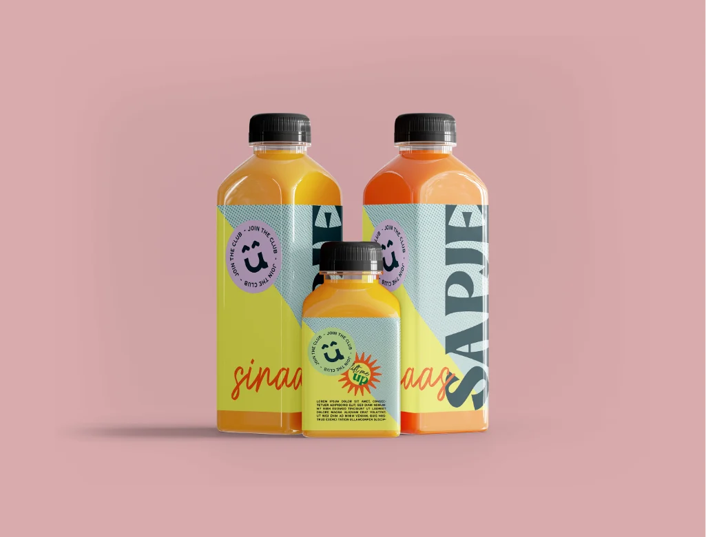
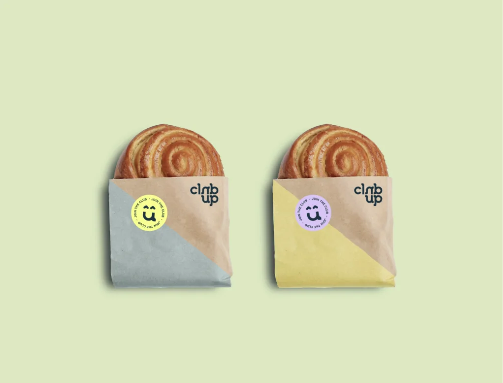
Inspired by the values of a healthy lifestyle, the design of vintage fruit stickers, and the student tradition of sticking stickers everywhere, we developed a set of illustrations and stickers that can be applied to all Club Up products.
To bring the newly developed identity together with the interior layout and structure of the existing canteen, we designed illustrated and colorful panels for the partition walls/doors. We also considered how all the elements can be combined to level up the space.
Join the Club!

Schedule an introductory call and tell us more about your brand. We usually get back to you the same day!
info@truecoloursagency.com
+310628174670