Thank you! Your submission has been received!

Oopsie! Something went wrong while submitting the form...

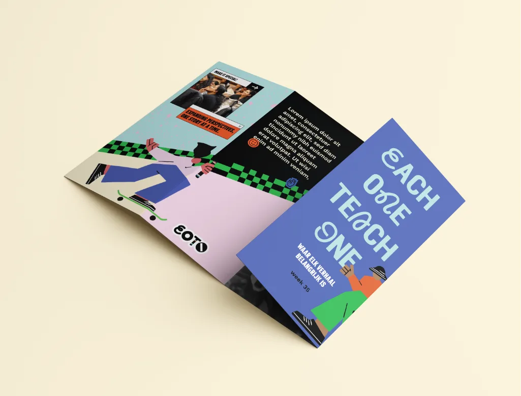
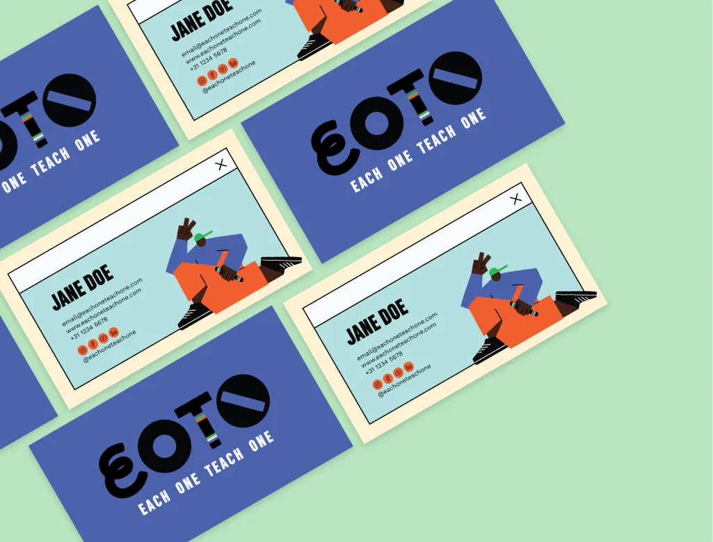
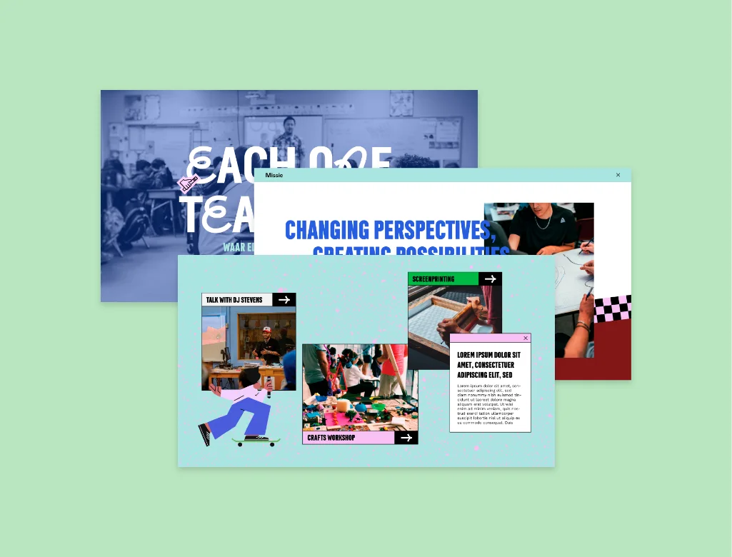
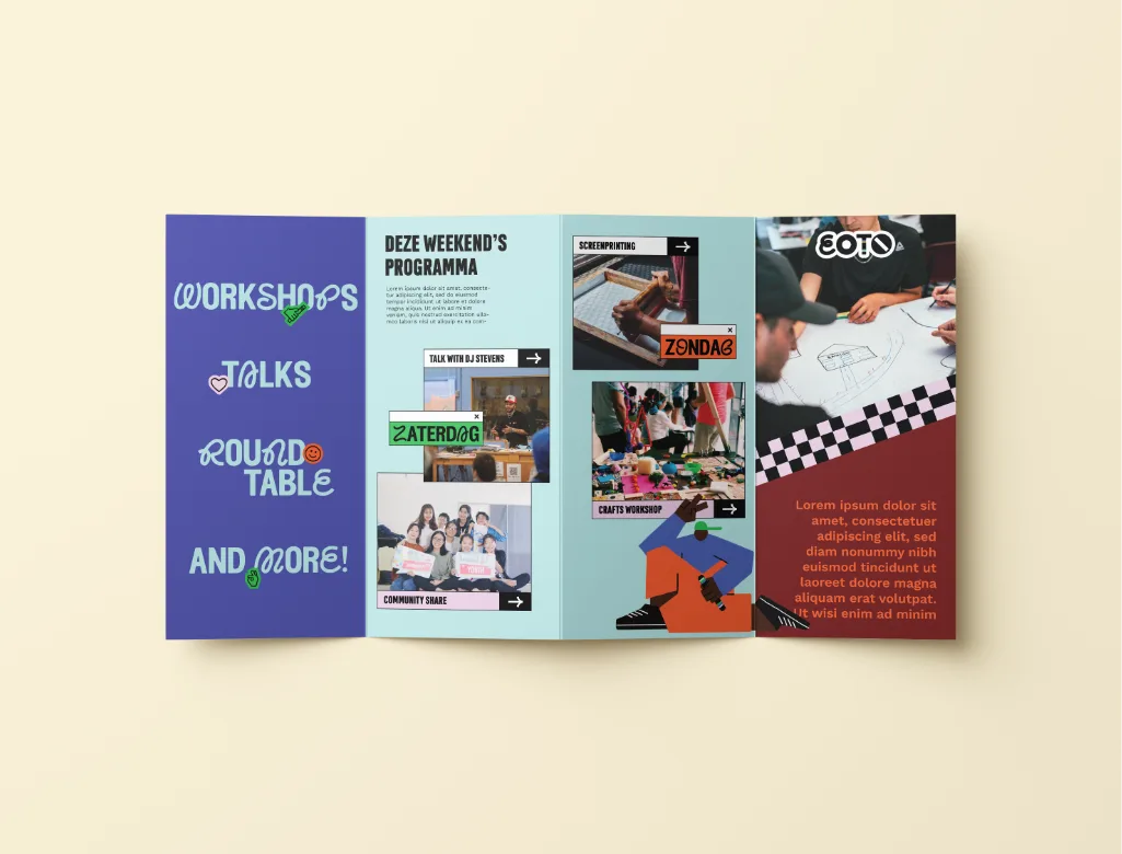
Our studio was asked to develop the positioning, strategy, concept & graphic design for EOTO (Each One Teach One), an educational program for high school students for the new subject of Global Citizenship, offering both 1-day workshops and multi-day boot camps and teacher training for subject teachers and schools in the Netherlands. The goal was to create a brand that is strong enough to roll out nationally and become the 1st choice in the fast-paced interactive landscape of providers on the market. The combination of different fonts in the logo, each with its own shape and "personality", is meant to represent the coming together of different people, different backgrounds and culture. A bold and visually revealing approach. Where everyone comes together. The T in the EOTO logo is also designed to be used on a talking stick/baton, a powerful symbol of community and mutual respect. The result is a colourful, on-trend and vibrant identity that properly represents the multicultural representation of not only their target audience, but also how we can make the world a better and more inclusive place.