We created the positioning, brand identity and website for EOTO (Each One Teach One), an education programme for students. See the project.
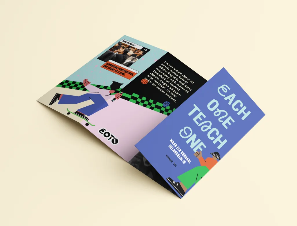
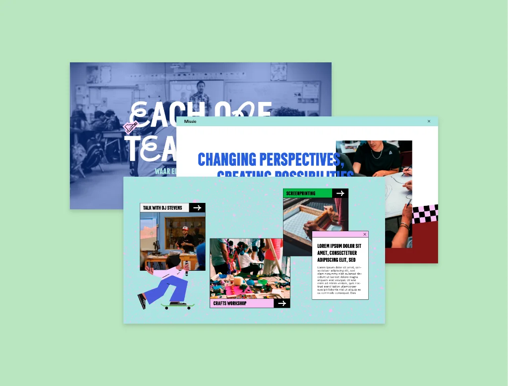
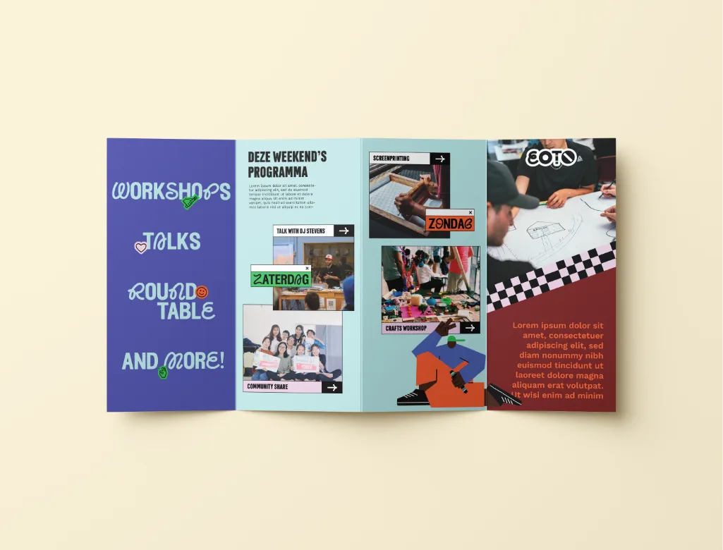
Our studio was commissioned to develop the positioning, strategy, concept, and graphic design for EOTO (Each One Teach One), an educational program for secondary school students focused on the new subject of Global Citizenship. The program includes one-day workshops, multi-day bootcamps, and teacher training for educators and schools across the Netherlands.
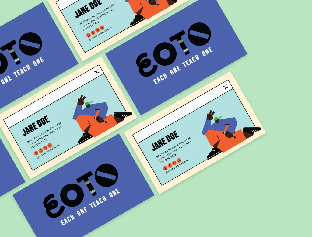
The goal was to create a brand strong enough for a nationwide rollout, positioning it as the top choice in the fast-paced, interactive market of educational providers. The combination of different fonts in the logo, each with its own shape and "personality," is intended to represent the coming together of diverse people, backgrounds, and cultures. It is a bold and visually striking approach. A place where everyone comes together. The T in the EOTO logo was also designed to be used on a talking stick/baton, a powerful symbol of community and mutual respect.
The result is a colorful, trendy, and youthful identity that effectively reflects the multicultural representation of not only their target audience, but also how we can make the world a better and more inclusive place.
Schedule an introductory call and tell us more about your brand. We usually get back to you the same day!
info@truecoloursagency.com
+310628174670