We created the strategy, brand identity and website for PcHooftstraat.nl, with art nouveau tiles and a modern icon. See the project.
The PC Hooftstraat: who doesn't know it? The retailers' collective asked us to develop a strategy and graphic identity for their store index website www.PcHooftstraat.nl to put the street back on the map as a fashion destination for both locals and visitors!
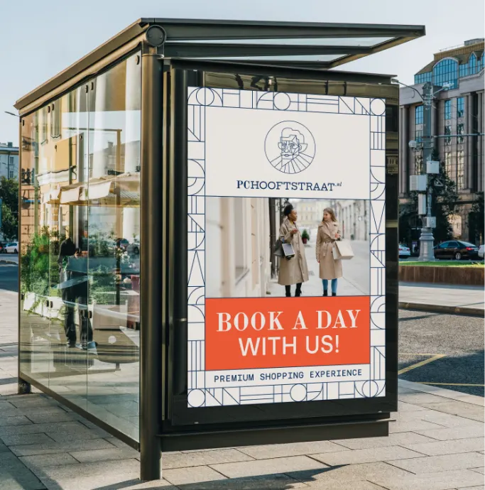
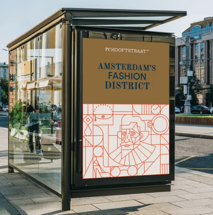
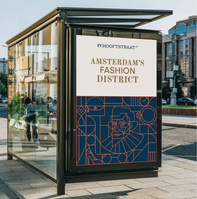
Fashion houses have existed for years; they are part of our cultural landscape and radiate a sense of luxury that cannot be replaced by anything else. Yet, in recent years, new trends have emerged that mark a shift toward modernity. Inspired by this idea, we developed an identity that is sophisticated yet bold, showcasing Amsterdam's sense of fashion, heritage, and architecture. This visual identity will appeal to the tastes of fashionable shoppers while simultaneously inspiring the more daring souls. A modern take on fashion heritage. The use of two different font styles represents both the luxurious heritage AND the new trends and modernity.
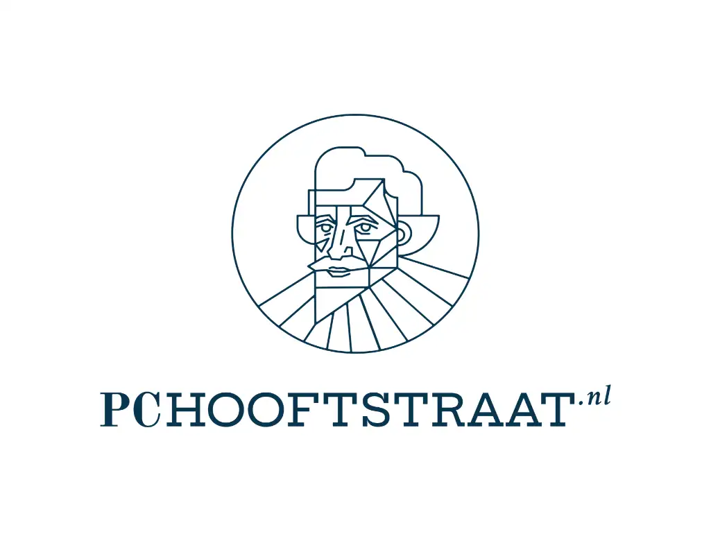
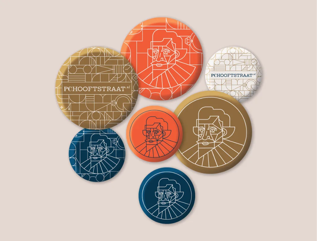
Pieter Corneliszoon Hooft, for whom the street is named, was an artist himself and inspired us to create a modern-looking icon of him that can be used as a logo. Unique art nouveau tile design, specially created for the new identity of the PC Hooftstraat. The combination of the tiles and luxury elements creates an interesting, eye-catching design. We found art deco in the street area and were inspired to create something special for the visual appearance. The tiles and the pictogram were crafted in a special way so that they can fit together as a single work of art.
Schedule an introductory call and tell us more about your brand. We usually get back to you the same day!
info@truecoloursagency.com
+310628174670